Seven don’ts for websites
The following is a list of seven things that frequently bug me about websites.
-
Intro page where you have to choose your location or language. If I go to foo.com then the .com indicates that I want to see the American version of the Foo Inc. website. I do not want to see a map of the world where I need to click several times to finally get to my destination. A better solution is to put a link somewhere that allows you to jump to other versions. Flag icons work well here, because you don't need to understand the language of the current version to jump to a different one (e.g. finding “Germany” on a Chinese website is difficult if you don't read Chinese).
-
Site version determined by IP location. If you use a web browser, the websites you are visiting know your IP address (five digits such as 127.0.0.1). In principle, this address is completely abstract (as opposed to, say, ZIP codes which can be mapped to a location), but there are databases that allow you to map it back to a location. This works pretty well, but is sometimes abused to automatically switch to the language of your location. But what if you are an American who is abroad and wants to access an American website. Or if you are German and want to check out an American website (not its German version). Solution: A small note in the language the site thinks it has detected. Something like “Click here to see the English version of this page”.
-
Skippable intro page. Often such a page shows a movie that tells you what the website is about. By all means, link to introductory information on the home page, but don't force me to watch/read it, every time.
-
Complete site implemented in Flash. I don't particularly like Flash. It still has its uses for video, but most other things can now be done in HTML5. With Flash, you cannot bookmark pages or copy text. The website's content cannot be found via Google and it won't work on (most) mobile devices. Furthermore, most Flash websites make up strange new ways of navigation. Why change something that people know and that works well?
-
Ugly URLs. URLs should be compact and easily understandable by humans. That is, one should be able to figure out what a page is about by looking at the URL. Thus, if the page ever goes away, one has a greater chance of finding out where it went. Amazon is both a sinner and a saint here. Some Amazon URLs have a lot of ugly pieces in them (“ref” and such). On the other hand, book URLs sometimes include the ISBN and an abbreviation of the title. This is a great practice, because the ISBN is a unique ID that is useful to both machines and humans and because the title allows humans to figure out what is there. Lazy programmers sometimes let the fact that there is a single script that displays all web pages show up in the URL: www.example.com/display.php?page=start. Even worse are meaningless page IDs (?page=17). Both can be avoided by putting in a little more effort.
-
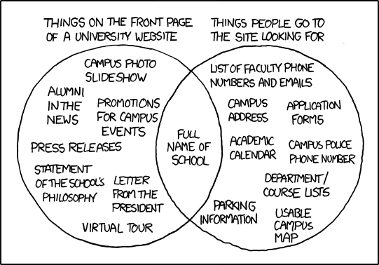
Content is hard to find. Often, a website shows all kinds of details, so that the things that people are most frequently looking for are hard to find. Especially expert-designed web pages suffer from this, because it is often difficult to focus for experts (in their area of expertise). Examples are bank and government websites. But food websites are also often problematic: I don't want to play a game, I want to find out about the products and/or their ingredients. Example: See picture below.
-
Error page discards original URL. This is fortunately rare, but every now and then, I discover an error page in my browser that says “page does not exist”. The problem is that the original URL is nowhere to be found: The error page URL has replaced it in the browser address bar (=history cannot be used) and it isn't displayed on the error page. If there are many tabs open then it's really hard to figure out what went wrong.
Bonus: Forbidding or enforcing characters in passwords. As if passwords weren't annoying enough on their own, some sites decide to make handling them even more complicated. Hassles I've experienced so far were: At most 10 characters allowed, no punctuation allowed, must use a digit.

Source: xkcd


